National Student Index
2025 re-design of the National Student Index web application
National Student Index (NSI) is a web application that contains a database of all NZ student NSI numbers. It can be accessed by teachers (via the ESL broker) to search for student records and manage student details.
The site is over 20 years old and the UI was very outdated. My role in this project was to re-design NSI to give it a modern look and feel that complies with Ministry of Education design system and branding, with dev constraints, user pain points, and stakeholder expectations in mind.
Tools: Figma
Design objectives
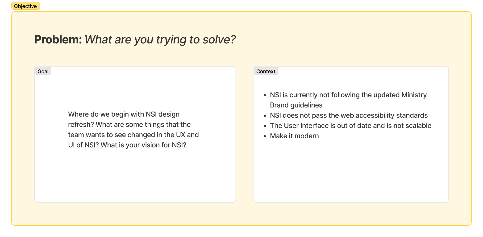
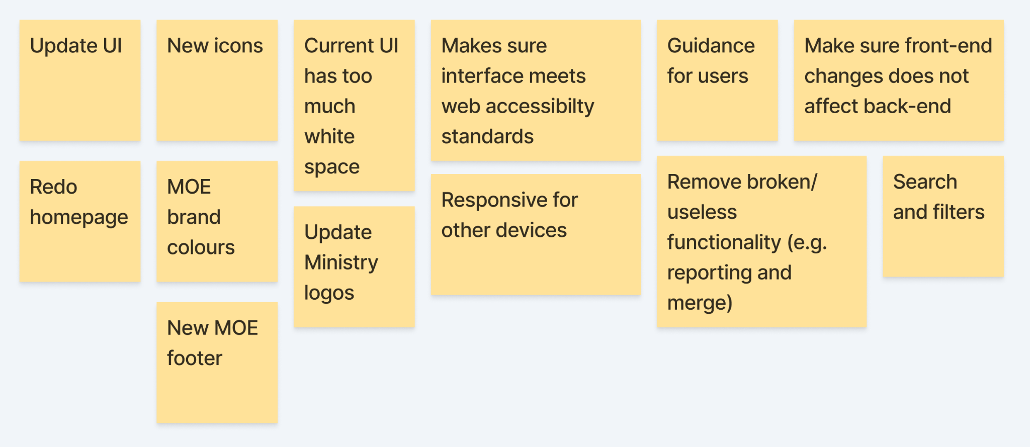
In the discovery phase, a workshop was conducted with stakeholders to define the key objectives of this re-design project. The wider NSI team needed to be in agreeance on what needed to be accomplished for the minimal viable product given time and budget constraints. The key requirements that came from this discovery are outlined below:
Current state mapping
Previous NSI user flow mapped out to show all pages and possible user journeys
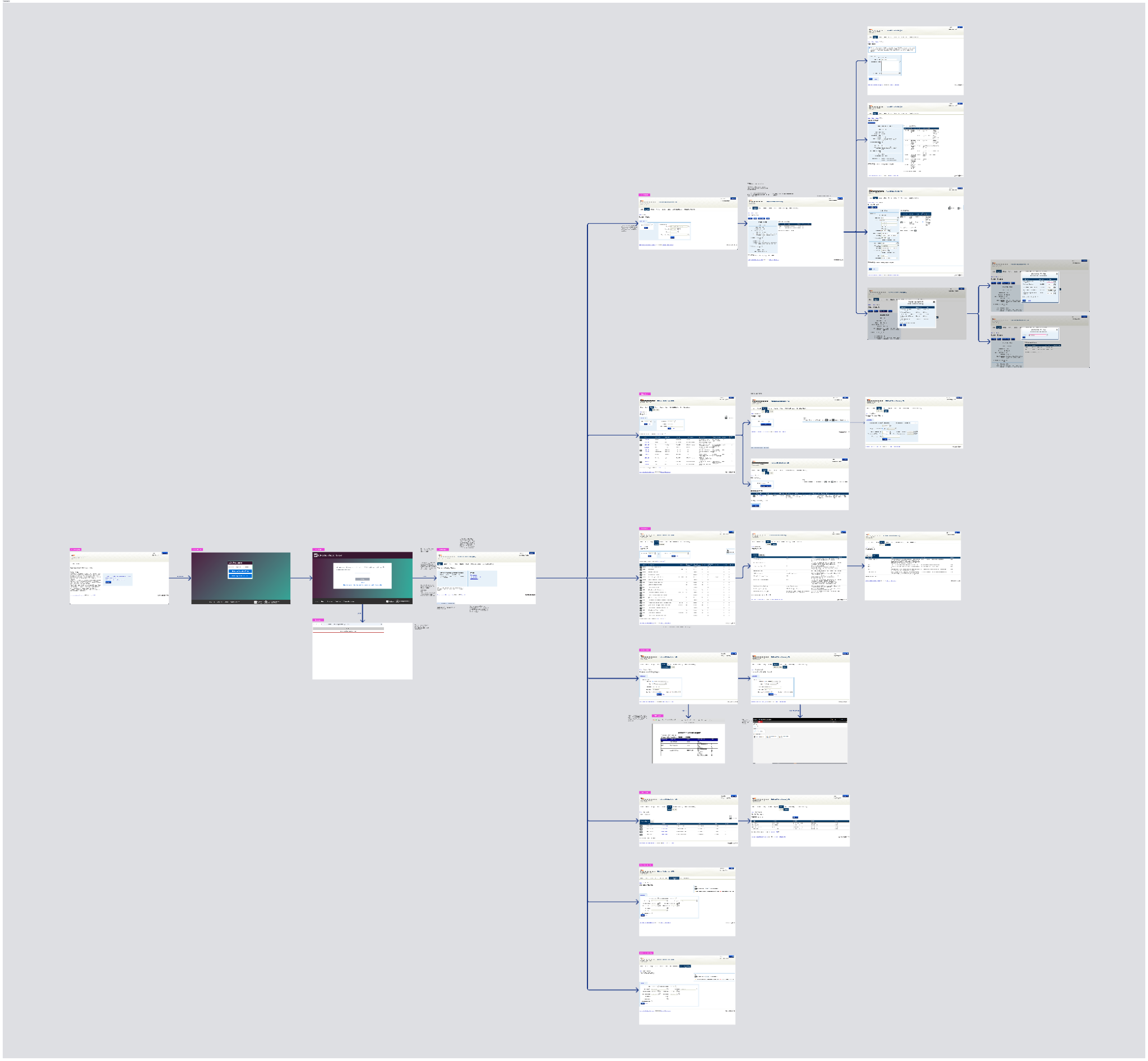
Colour and typography
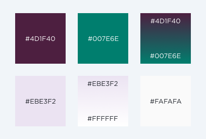
The colour palette uses the Ministry of Education Te Tāhuhu brand colours. This is the primary colour palette for Ministry of Education websites/web applications and collateral.
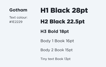
The font family, Gotham, is the flagship typeface used throughout all Ministry of Education websites, chosen for its legibility, versatility, its support of macrons for te reo māori words.
Dashboard UI Inspiration
Some dashboard design inspiration taken from various web applications to inform my design concepts.
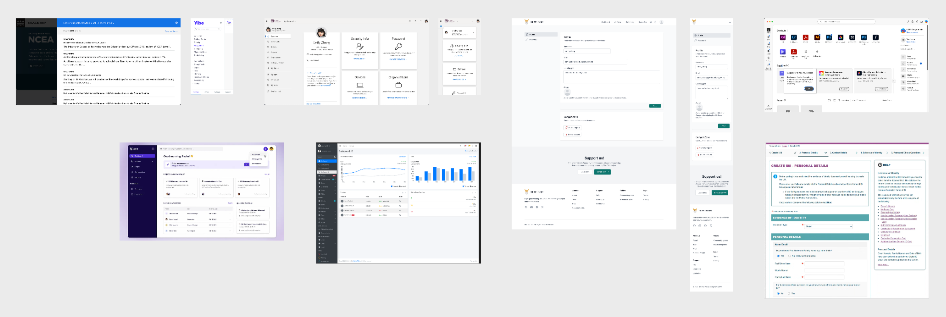
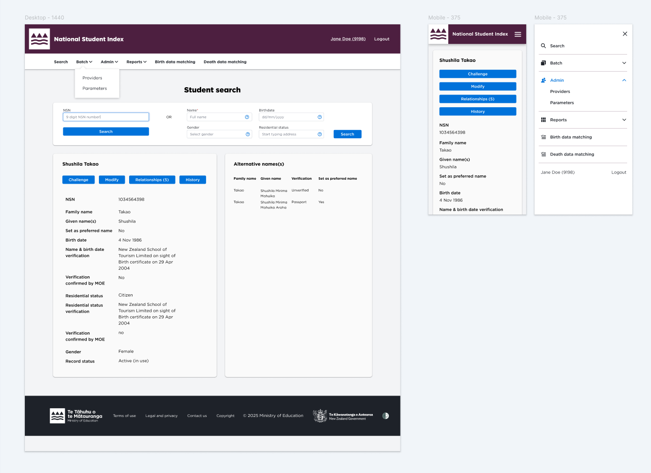
Design 1
In this inital concept, the interface is re-designed to have Ministry of Education branding, the header and footer have been updated, the typeface has been changed to Gotham, and all UI components are compliant to the current Ministry of Education design system.
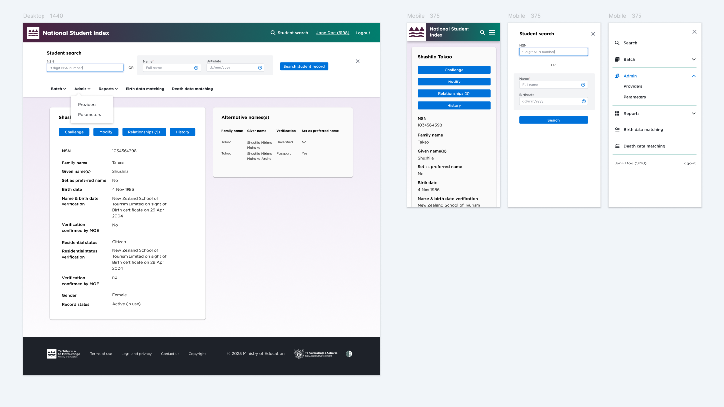
Design 2
In this design, the search feature is a sticky component that stays at the top of the page underneath the header, as opposed to having it on a separate page. Because search is the most integral feature of the site, it was important to have it easily accessible to the user. Users often have to navigate between the search page and other pages, therefore having the search feature always available as a fixed component on the page saves that extra back and forth.
Design 3
A side-bar is added on the left. This makes everything easily accessible from one place and also will free up more space on the screen if the Ministry of Education logo, nav items, and footer links are all contained within the side panel. The terms of use and legal and privacy links are fairly important for this product and having them in the side-bar made them more visible (rather than hidden in the footer).
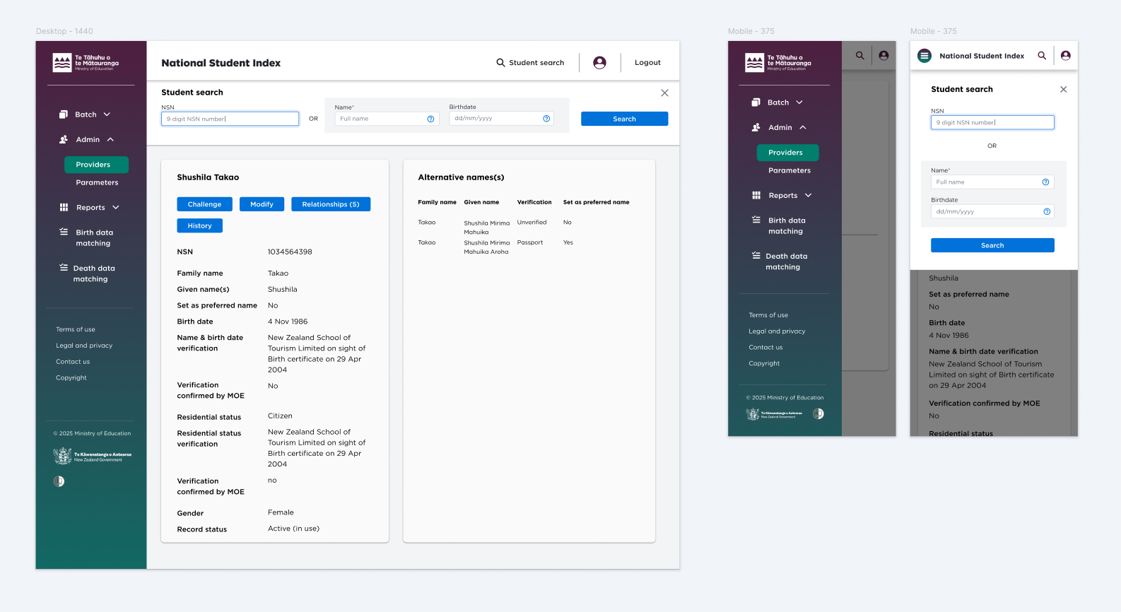
Chosen Design
Design 2 was chosen for its visual aesthetic as well as development feasibility within the constricted delivery timeframe.

Final design
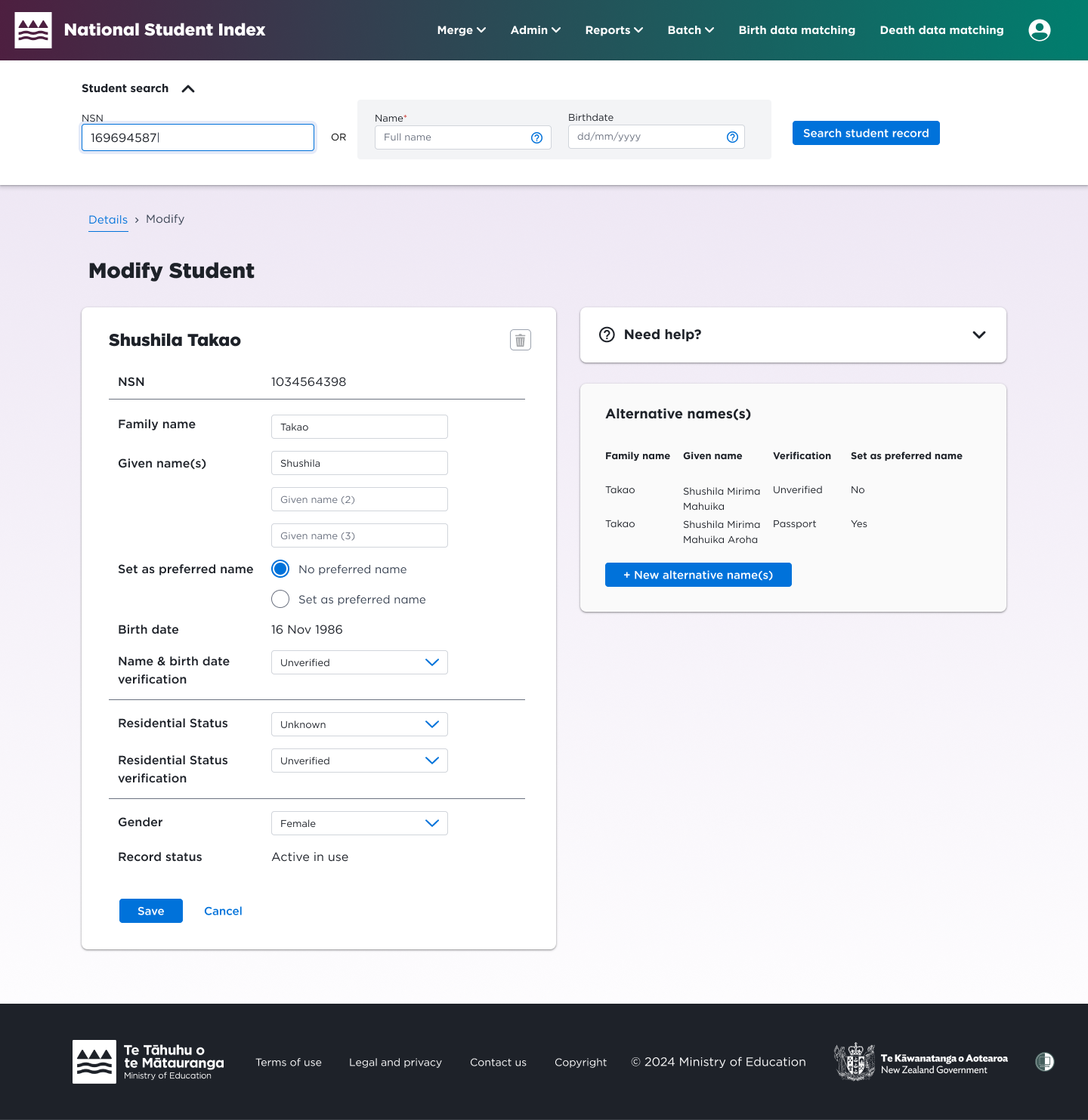
With stakeholder and developer feedback taken into consideration, the chosen design was further iterated — the sticky search component was made collapsable (to save screen real estate), content was given more visual hierarchy, and a "need help" component was added to provide user guidance. The final design is shown below.
BEFORE
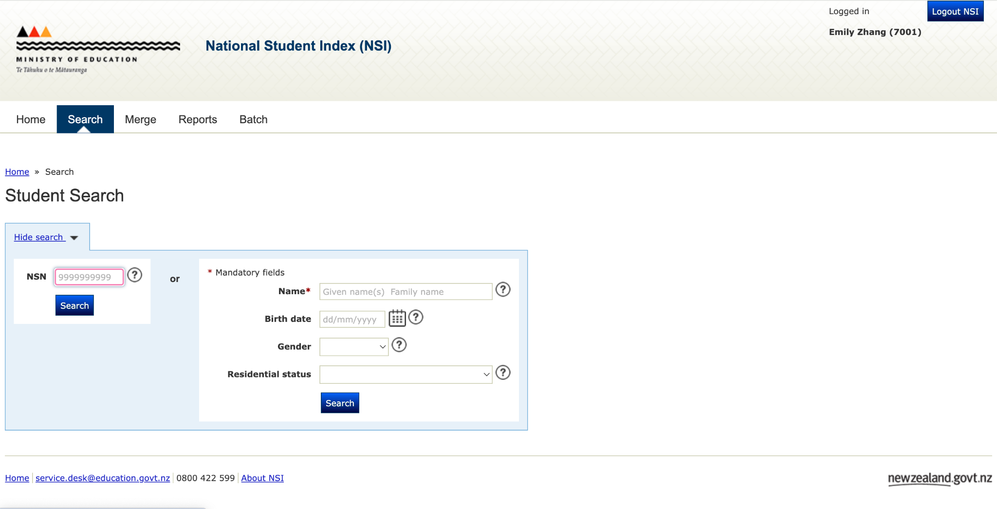
AFTER
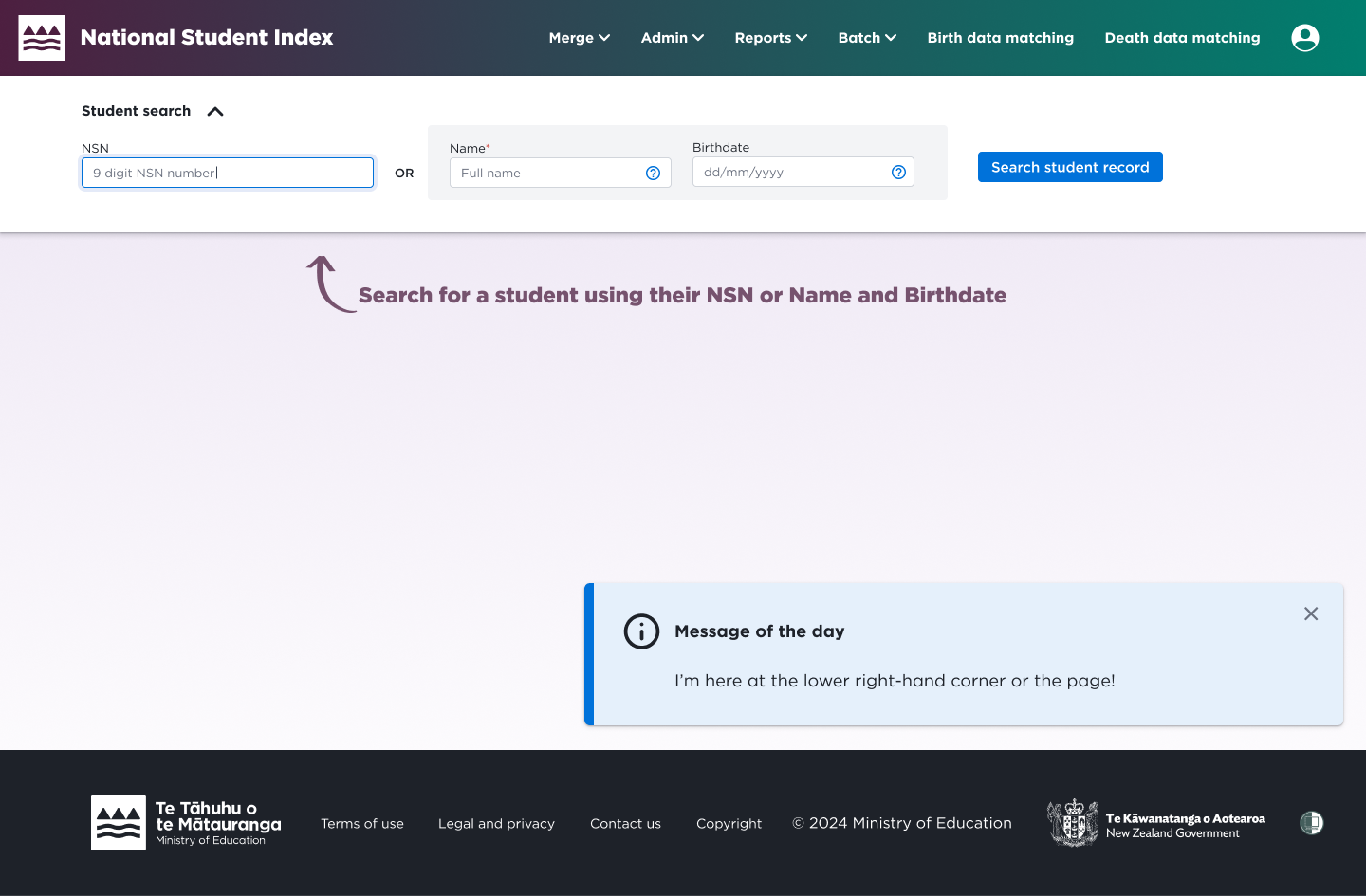
BEFORE
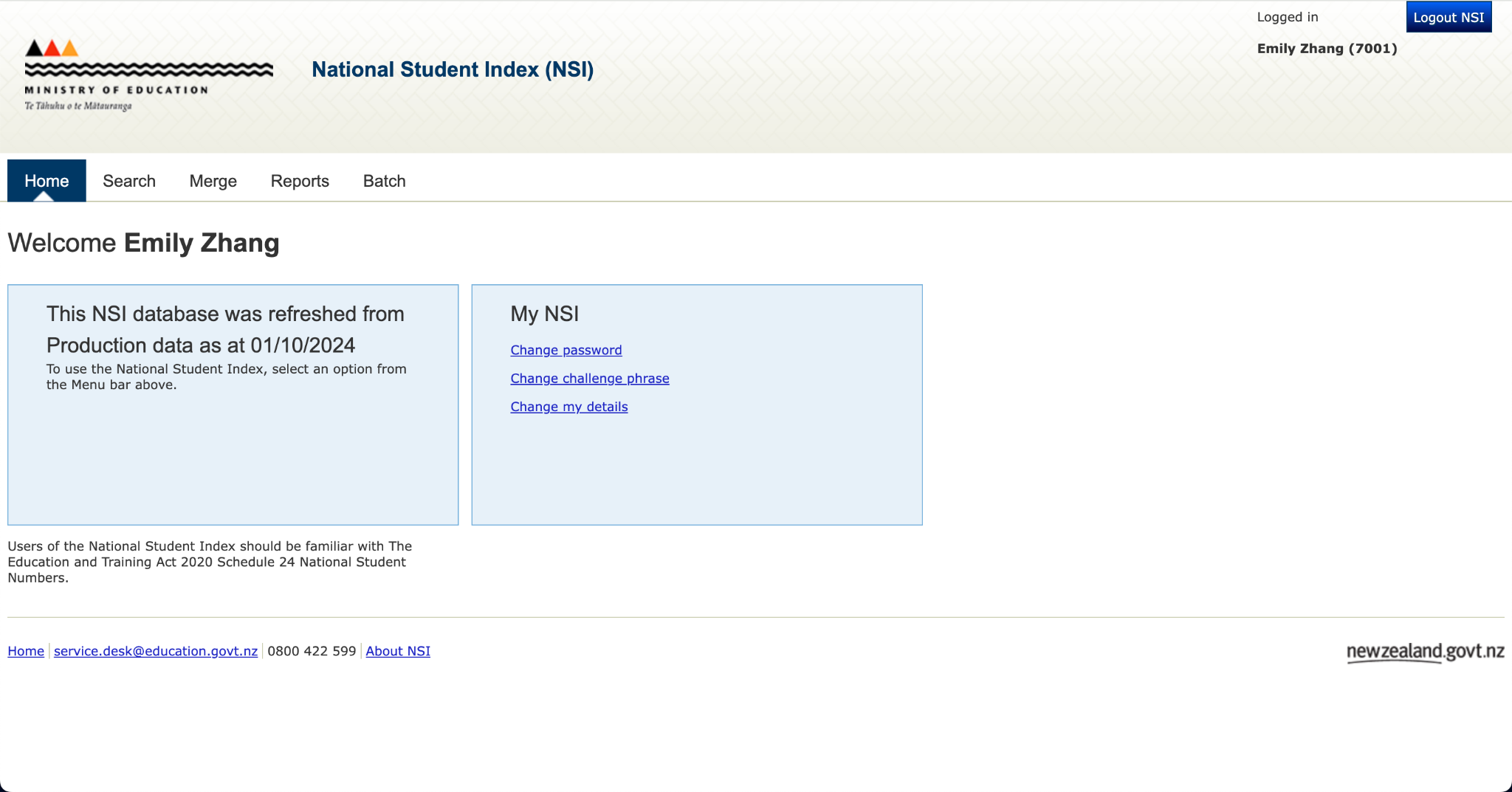
AFTER
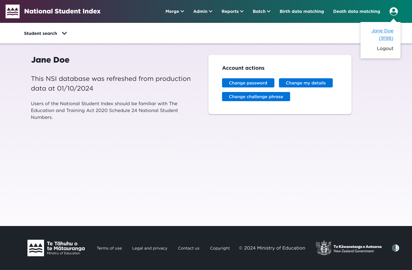
BEFORE
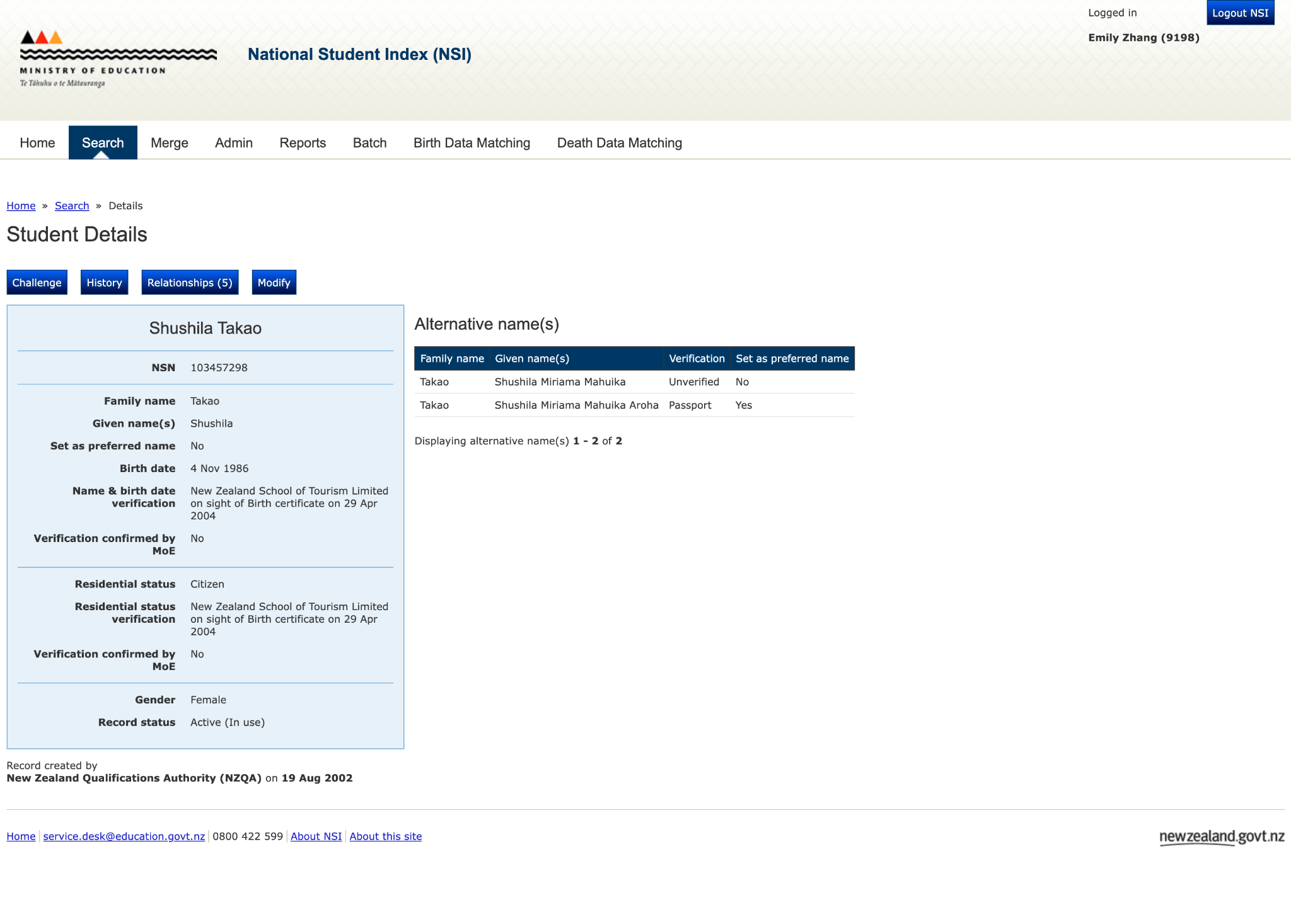
AFTER
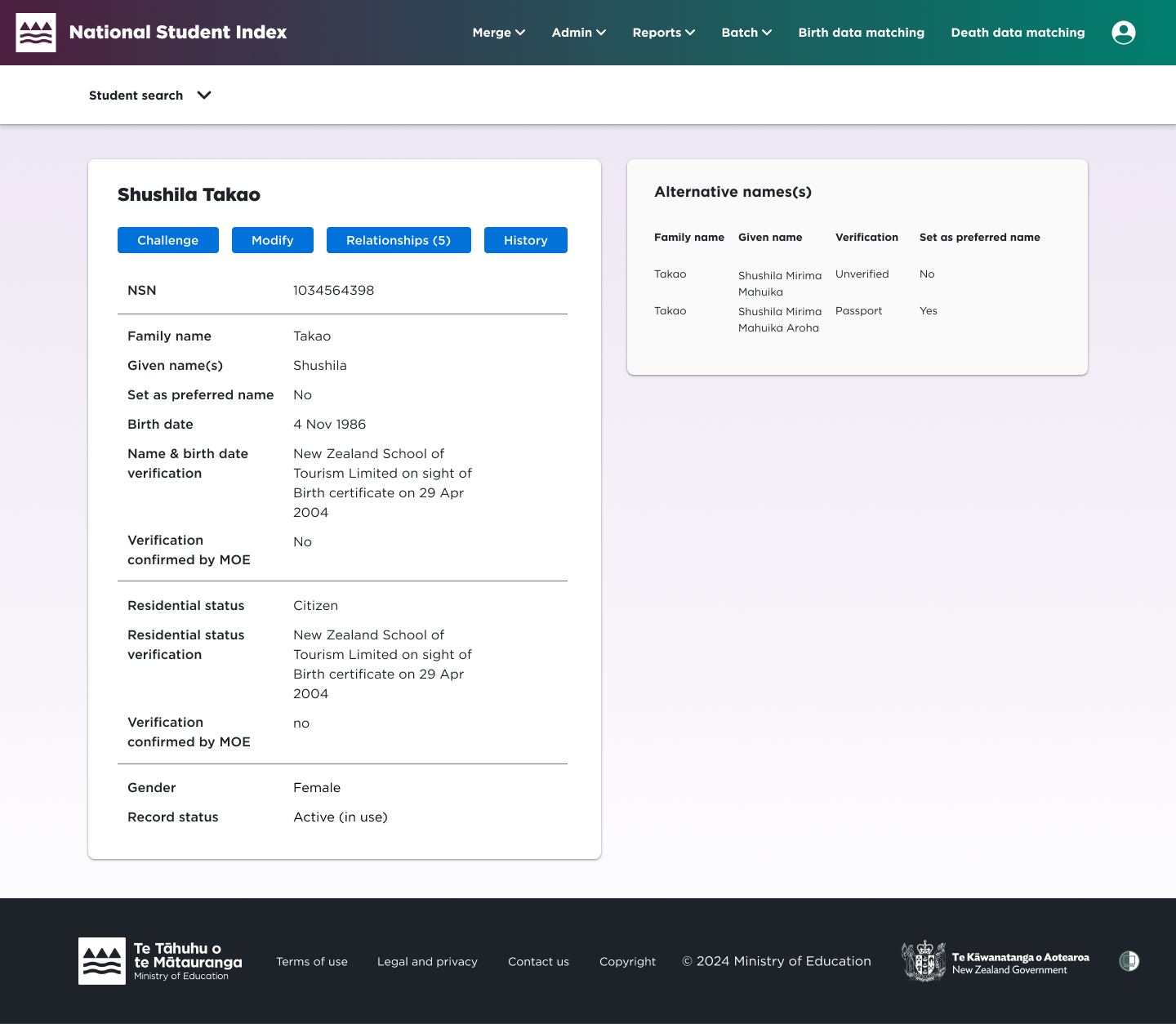
BEFORE
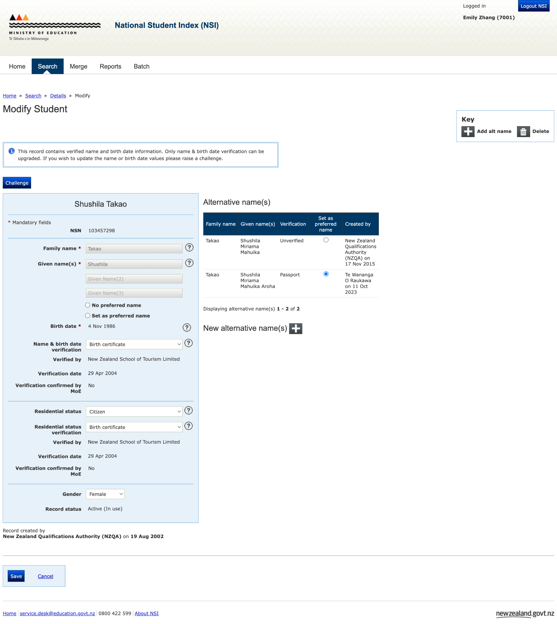
AFTER
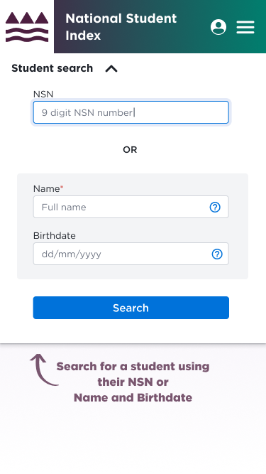
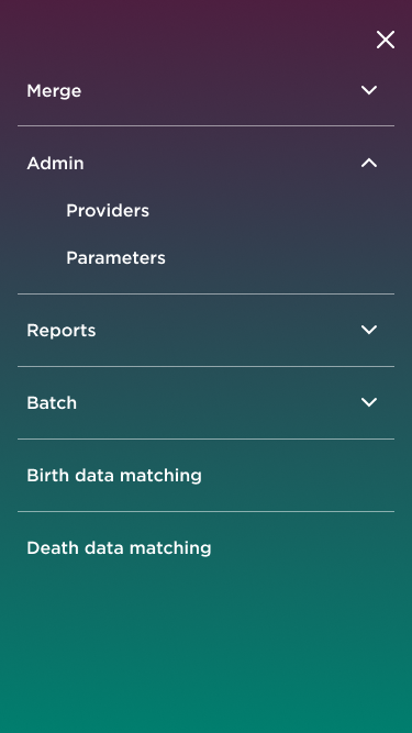
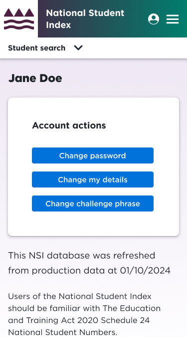
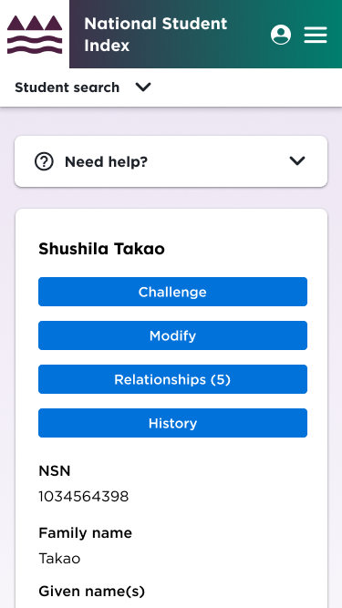
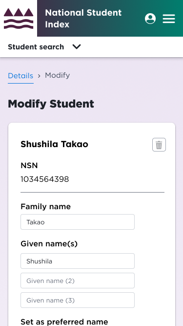
Final design mobile views
Responsiveness was an objective for this re-design as the site was originally not responsive to mobile and tablet
Thanks to —
UX Lead: Ramya Ravishankar
Product owners: Dara Ny, Matthew Sell
Developers: Magda Jagielska Giergiczny, Chanaka Jayarathne
